Did you like that video? I didn't. Not at all. To me, the sound of my own voice just ruined the whole thing. But hey, maybe you liked it, and I suppose that's all that counts. 'Cuz I do it for the people!
And just look at all those happy people (they were only happy because this was the start of the first day of shooting, in their minds, making a film was only going to take a half hour... my how they were wrong)
Anyway, something I didn't bother covering in the video, was the overall look of the film. When I first set out to make this, I had imagined a very harsh, contrasty aesthetic like this:
("City of Lost Children" 1995 - DP Darius Khondji)
(...and also, the exact face I made during the entire production)
However, getting a look like that requires lots of lights and that nasty little thing called time.
And I had neither.
So, because I was shooting all natural light, the contrast levels and general form of the light ended up changing to something considerably softer, almost dreamy.
In the end, I went from a "Darius Khondji" to a "quasi-Bruno Delbonnel" (and I don't have the photographic talent of either of them).
A huge stylistic difference, of course, but still suitable for the subject matter.
("Dark Shadows" 2012 - DP Bruno Delbonnel)
I ended up making a custom LUT for this film in Photoshop. It's actually a simple process which, for the sake of time I'll not retype. Instead, how about a link to a tutorial -- click here.
No wait, not there, HERE.
Anyway, after applying the LUT, I then put an edge blur and slight vignette on an adjustment layer, then added film grain, and an overall warp to the corners of the image to give it a vintage anamorphic feel.
It means I wanted it to look weird and dreamy and old and it was a lot of work.
Art Department Stuff
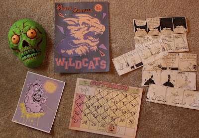
I made a ton of props for this -- all very last minute -- but, thankfully, I've amassed quite a collection of random posters and illustrations over the years that have come in handy.
The comics on the right are from my year as a cartoonist for a local paper called The Far Corner.
The poster (right) I made in Photoshop, Frankensteined out of stock images and vintage fonts. The page from the book (left) I made, printed, and taped into a random book I had around the house. I changed the page color and printed an appropriate page number so that it appeared to belong in the book from the beginning.
Some posters I threw together just for this short. A big thanks to the folks at OfficeMax for doing such a great job on these, they really reproduced well.
Now, for the bedroom location -- I couldn't find a room that looked how I wanted on short notice, so I ended up converting my own room into the "set" for part two.
Everything had to be rearranged, a complete overhaul.
I moved the bed into the little nook in front of the closet and attic doors. To make it seem like that was just another wall (and not just a stupidly impractical way to arrange furniture) I bought a cheap night sky tapestry and tacked it up over the doors -- I also removed the doorknobs so there wouldn't be any weird lumps poking out behind the cloth.
And of course, everything was tied together by an enormous amount of posters, X-mas lights, and general clutter, to really give it that lived-in feel.
About Music
The "score" if you will, was pieced together from royalty-free tracks from Purple-Plannet Music and other bits that I created in Garageband.
This piece is one of the bits I made that I'm not too horribly embarrassed to showcase:
I've been given the opportunity to do some VFX work for the guys over at Small Town Monsters! Their new documentary "The Flatwoods Monster: A Legacy of Fear," will be coming out this April.
So keep your eyes tuned for that!


